Peter Allen Design won Designer of the Year for the PPA, BSME and PPA Independent Publishers Awards in 2021 for his work on Magneto Magazine.
And the winner is...
Peter Allen won Designer of Year for his art direction of Magneto Magazine. The judges said:
Peter demonstrates strong design skills and its clear that he has been a major factor in the success of Magneto. The covers are dynamic, striking and sleek and the graphic devices used give the strong sense of a contemporary brand in what is often a traditional market. Peter is possibly the best designer of car magazines in the world today.
MOTHER & BABY REDESIGN
Mother & Baby is the UK's no.1 parenting magazine. Research showed it was trusted and informative, but also that it wasn't considered modern or a treat to read. I undertook a complete design transformation, using informal and contemporary fonts and doodles, a sharper more modern colour-set and more relaxed, natural page layouts. The literal, workshop manual-style imagery was replaced with more welcoming lifestyle photography while I worked hard to maintain an authoritative look. There was an immediate positive impact on sales.
The World Food Programme animated Annual Performance Report
The World Food Programme wanted to make their Annual Performance Report more dynamic and accessible. Previously it had been a PDF download. I worked with Furthr, the content marketing agency to create an animated online edition. WFP's key achievements are presented in simple, straightforward visuals that move, grow and explode for maximum impact.
Watch the clip below to see the animation or go straight to the site to see the full effect.
Car Magazine redesign
This needed to reflect the shift in tastes of modern car enthusiasts who are now obsessed with car technology as well as performance. The new cutting-edge premium look reflects the technological emphasis, and three new regular sections were given distinctive, different looks. Infographics and graphics are used to explain the new automotive technology. I developed a new philosophy of picture usage, where fewer images are used bigger to create impact and increase the premium look. On the cover the logo is now supported by a background solid colour to create a distinctive presence on the newsstand.
Landscape magazine logo design
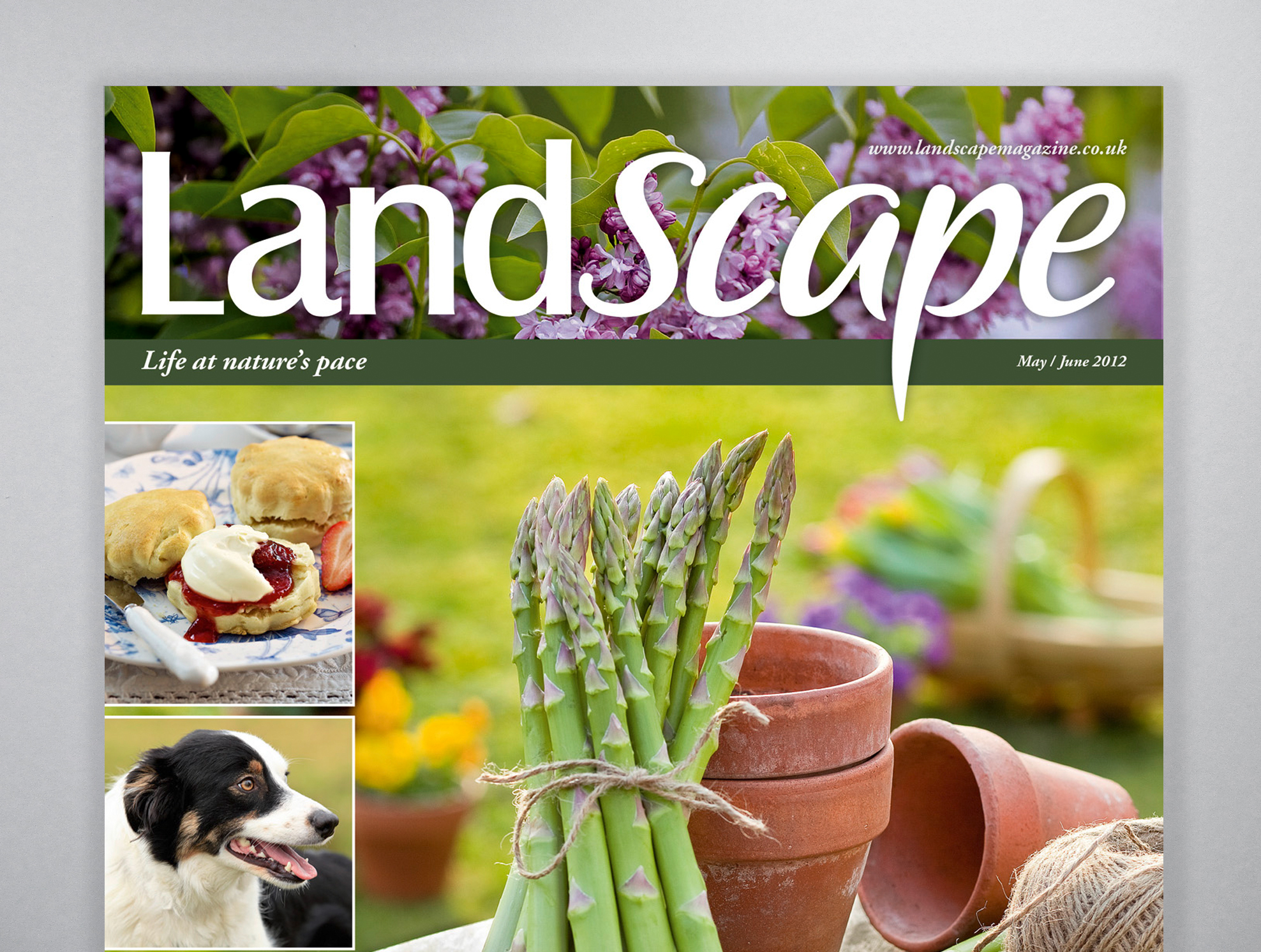
For the launch of Bauer’s new women’s lifestyle magazine, LandScape, Art Director Alex Tapley asked me to design the title’s new logo. The first part of the logo is based around the magazine’s main display typeface, Castle. The second part is a bespoke brush script created especially for the magazine. The logo has been designed in different weights for multiple uses throughout the magazine.


